

Case Study | Mars Vet Health | Voyager Health Petcare
An App That Makes Pet Care Easier, Starting With Booking
Role
As a product designer on the team, I contributed end-to-end: wireframing, prototyping, testing, iterating, and delivering final visuals. I also helped drive alignment across engineering and stakeholders, contributed to the design system, and created visual storytelling tools that helped push the project across the finish line.
Summary
Voyager Health Petcare is a comprehensive pet care app designed for Mars Vet Health, intended to unify multiple brand experiences under a single platform. The app enables pet owners to manage veterinary appointments, access health records, shop for products, and stay informed through educational content. While I worked on the entire app experience, this case study focuses on the appointment booking flow, an MVP feature a high-priority feature that would form the foundation of the user experience.
Timeline
Summer 2022 – Winter 2023 (8 months), ~2 months for the booking feature
Platform
Mobile App
Team
1 Designer, 1 Researcher, External Dev Team
Highlights
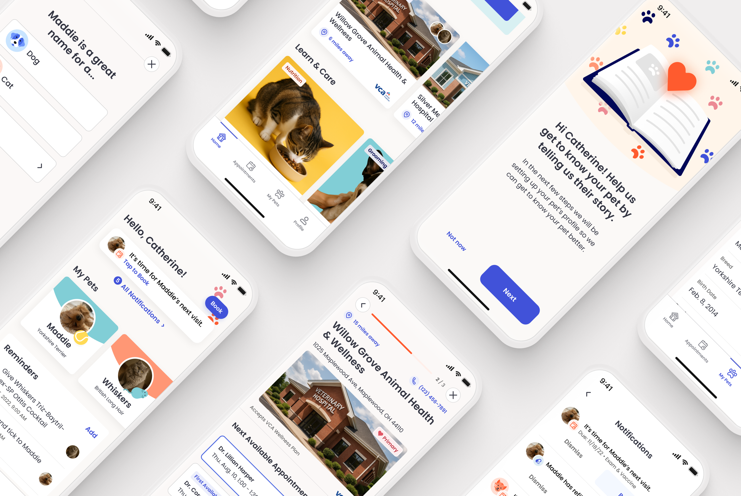
Designed a Smart, One-Tap Booking Experience
Leveraged known user data, pet data, and previous selections to pre-fill steps, allowing users to book in just one tap, without sacrificing control or clarity.
Created the App’s Visual Direction and Design System
Established a “Playful & Welcoming” brand identity while building modular, accessible components that support future white-label branding.
Validated and Launched a Wizard-Style Booking Flow
Through usability testing, selected a step-by-step booking approach that reduced cognitive load and increased user confidence in a high-trust, high-emotion experience.
Make booking feel fast, trustworthy, and human
Our goal was to create a fast, reliable, and stress-free way to book veterinary appointments, whether routine or urgent. Users needed speed and reassurance but also wanted confidence they could secure an appointment quickly, especially for urgent care. The app had to integrate with the existing Voyager platform, which powered the backend systems used by vet clinics. Since the product would support multiple brands under the MVH umbrella, the design needed to be flexible for white-labeling and scalability.
“I like seeing their picture. It’s like I’ve seen them already, even if we haven’t met. I’m not walking in blind.”
Users want fast care and a familiar face
We conducted market analysis, competitive audits, and user interviews with pet owners. We uncovered several insights:
Convenience was key, but so was trust and familiarity. Users preferred booking with the same veterinarian for routine visits.
In urgent situations, speed outweighed preference; pet owners were willing to travel farther or see a different provider to get care sooner.
Users were frustrated by complex booking systems and unclear appointment availability.
Adding a photo and bio of the vet helped ease anxiety and build trust, especially when users encountered new providers. Our solution needed multiple booking paths, flexible sorting, and filtering, and a warm, easy-to-use experience that kept the human connection front and center.
Guiding users, one step at a time
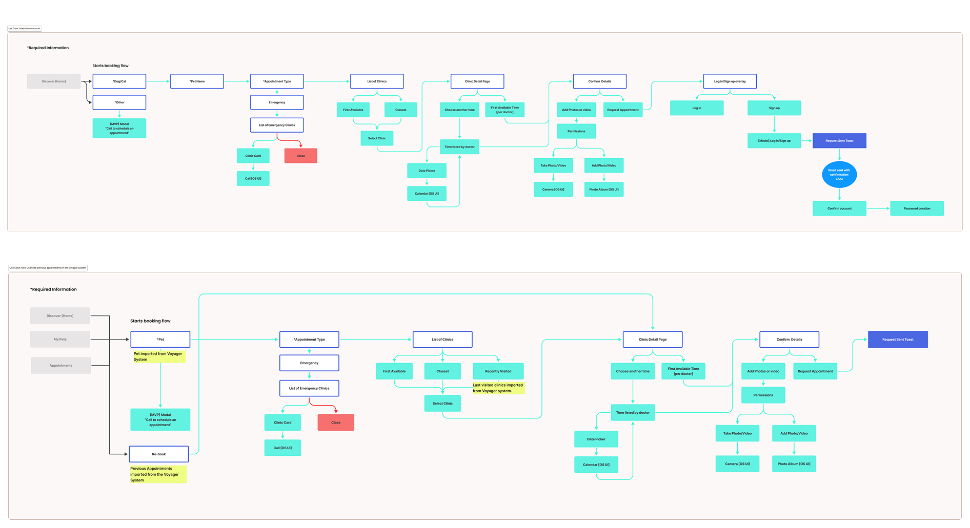
Our goal was to design a booking experience that felt seamless, smart, and reassuring. We identified three primary user types: guest, new user, and returning user, and mapped out six unique journeys based on entry points, user status, and the data available through MVH’s backend systems.
We explored two interaction models: a form-style flow and a wizard-style flow. I was responsible for designing the wizard-style experience, which guided users step by step. Based on user research and early feedback, this approach made the process feel more intuitive by breaking it into manageable decisions.
The wizard flow also allowed us to build in smart behaviors, like pre-filling known details and surfacing the first available appointments. This supported our goals of creating a personalized, accessible experience that could scale across future appointment types.
Insights into scalable solutions
I developed mid-fidelity wireframes that reflected the journeys we had mapped. Because we were also shaping the visual direction and design system at the same time, these wireframes became an important space for visual exploration. They weren’t fully styled yet, but they helped us define key patterns like layout, hierarchy, and how users would move through each step of the flow.
We introduced several smart behaviors to simplify the experience. If the system already knew your pet, your preferred clinic, and your reason for visiting, it would pre-fill those steps. In some cases, booking an appointment really could be done in one tap. Users could always review and change their selections. Our goal was to create a design that was convenient but not limiting.
Crafting a joyful experience that scales
One of the unique challenges of this project was building the visual identity alongside the feature set. Since the platform would eventually support other MVH brands, we needed a look and feel that was both flexible and distinct.
With limited stakeholder attendance at our design workshop, we shifted to a more conversational approach. This helped us uncover the stakeholder’s vision and align on a visual direction we called “Playful & Welcoming”, defined by warm tones, bright accents, and friendly illustrations. The goal was to reflect the joy of pet ownership, recognizing that for most users, this wasn’t just a tool, it was part of their bond with their best friend.
We carried this tone through key UI moments. When a user booked an appointment, for example, the interface showed the pet’s photo alongside the doctor’s profile and a cheerful illustration, reinforcing the personal connection users cared about.
With no existing design system, we built components from the ground up, balancing usability, scalability, and brand adaptability. Modular cards and repeatable patterns supported future growth, while clear hierarchy and accessible contrast ensured the experience remained easy to navigate and inclusive.
Listening, Learning, and Designing the Right Flow
We tested both design approaches through usability testing. Users responded positively to the guided experience, it eased decision-making by breaking the process into simple, focused steps. This approach reduced cognitive load and made the overall experience feel more thoughtful and intentional.
By surfacing familiar vets and previously visited clinics, we keep the existing bond between pets and their providers, which resonated strongly with users.
I worked closely with a researcher to gather and synthesize insights. I attended usability sessions and interviews, and together we used the findings to guide conversations with stakeholders and inform key design decisions.
Ultimately, we decided to move forward with the wizard experience after it tested well with users. Its guided approach helped users navigate the process smoothly without feeling overwhelmed. By emphasizing the pet’s history and individual needs, we created a booking flow that felt not only functional but personal and trustworthy.
A complete MVP booking flow ready for launch
Although the app is not yet live, the MVP designs were successfully delivered and developer-ready, with early user testing confirming the value of our chosen approach. The design system, flows, and foundational decisions are now shaping the product’s future evolution. The design work spanned key areas including booking, pet and owner profiles, appointment history, and account management. I also provided thorough documentation and a backlog of ideas for future enhancements, such as a discovery experience and more detailed vet profiles.
Throughout the project, I led regular design reviews with the client, shared prototypes for async feedback, and collaborated closely with the development team to ensure a smooth handoff. I built repeatable components in Figma that contributed to our evolving design system and established clear visual hierarchies to support both accessibility and long-term scalability.
Small team, big lessons
Working on this project stretched me as both a designer and a collaborator. I learned how to flex my process to match the client’s communication style and how to adapt when our initial approach needed adjustment. After running into a few bumps during the first feature rollout, I focused on improving how we communicated our design decisions, bringing more clarity and structure to the process, which led to stronger collaboration and alignment.
With a small core team, cross-functional alignment requires clear communication and coordination across roles and companies. This experience sharpened my ability to collaborate effectively in a distributed environment and deepened my appreciation for transparency and planning within cross-functional teams.
As a mentor, I had the opportunity to guide an intern through a critical part of the product, which helped me grow in my skills in giving thoughtful feedback and supporting someone else’s development alongside the demands of a project.
This project taught me how small shifts in tone and flow can transform an anxious experience into a confident one. It reinforced my belief that thoughtful design isn't just about usability, it’s about creating moments of connection, even in the most functional flows.